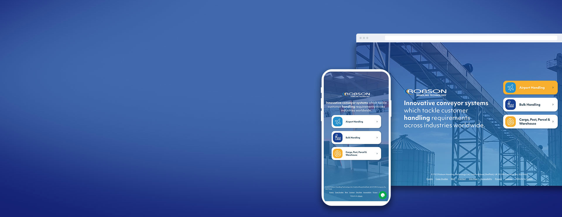
Robson Handling Technology create innovative conveyor systems across industries worldwide. They specialise in airport baggage handling systems but also wanted to push into other markets such as bulk handling and warehouse systems.
Project Included
How did we do?
"Molly, Rich and the team at Arkom have produced two very slick websites which look great, flow and are very user friendly. The Umbraco system is great and so easy to use allowing us to update the website content at speed. Blogs are created and published in minutes. Molly, Rich and the Arkom’s team meticulous attention to detail and excellent communication made collaborating a pleasure. I would highly recommend Arkom for your new website."
Julian Martin, Sales & Marketing Manager
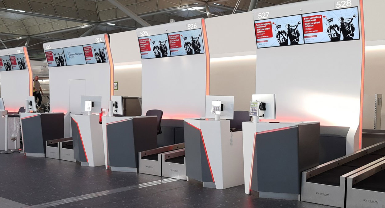

Solidifying their place in the market as a market leader
Robson felt their online presence was falling behind their competitors and wanted to solidify their place in the market as a market leader. The current website needed a refresh; the images were outdated, and all content needed reviewing.
Their product offering spans such a variety of different markets including Airport, warehousing and bulk handling conveyor systems. Each of these different markets needed a separate online presence, as well as a US website tailored to overseas customers; so the whole user journey needed to be rethought so that visitors were signposted to relevant areas of the business right from the start.
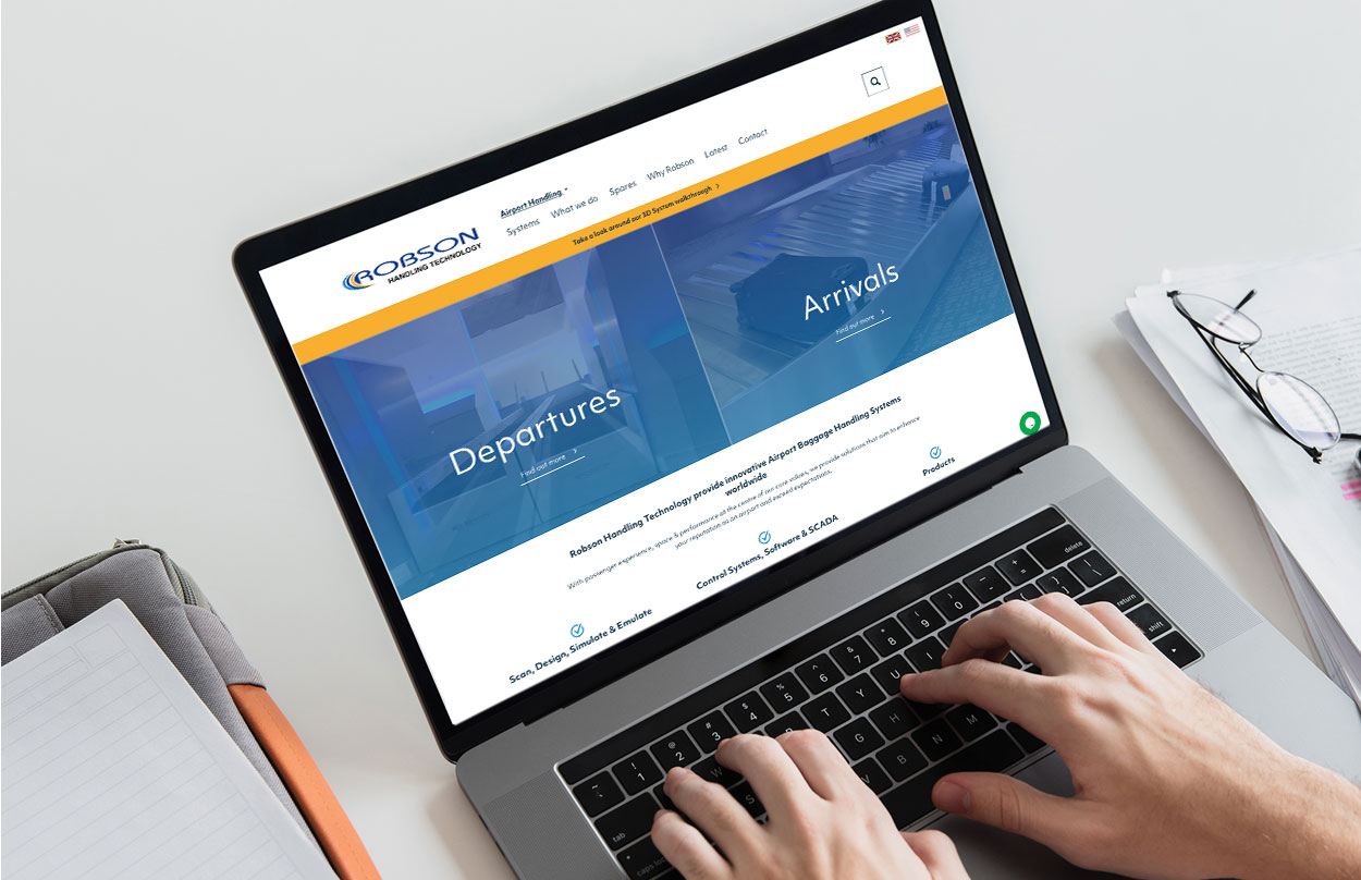

Improving the user journey with a fresh new look and feel
We absorbed the brief and brainstormed the design which we felt would provide the client with an improved journey for users, along with a fresh new look and feel.
This was presented via our creative concept phase where we worked closely with the client and their marketing team to dig deep to understand the journeys of the different demographics in more detail. The different market sectors were explored in detail and the journeys were defined from the findings of this research.

A revived website with an intuitive content editing experience
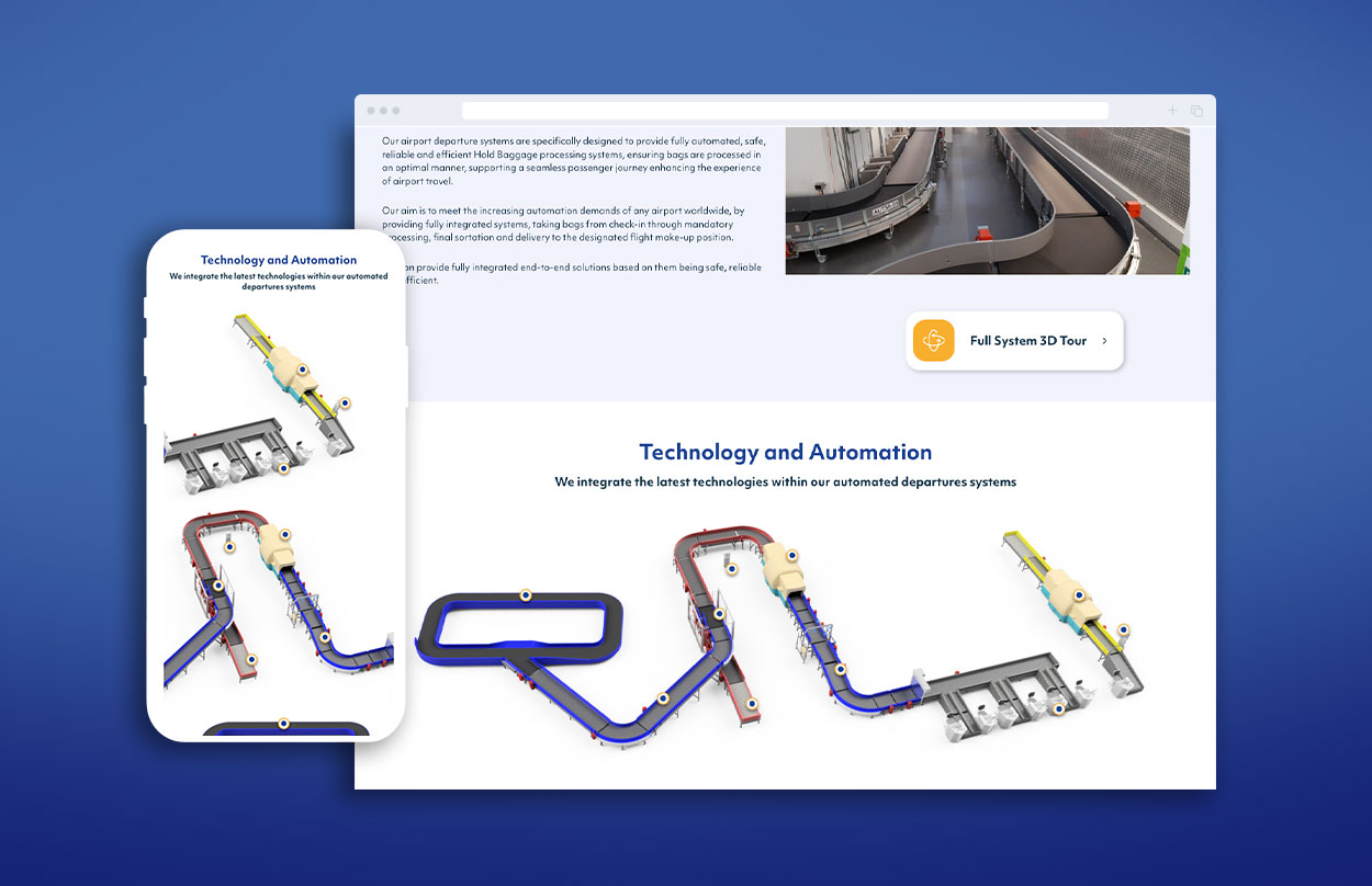
We provided the client with a revived website experience which offered a clear path from people landing on the website to the specific content they were searching for. The complex products and services on offer meant we utilised video content and interactive imagery to simplify the journeys and to help users understand the product and navigate the website efficiently, whilst also adding the wow factor.
Along with the re-design, we implemented a brand-new Umbraco CMS on the back end to relieve the team of the stresses caused by the rigid CMS they were using. Umbraco is known as ‘the friendly CMS’ and is renowned for being intuitive and easy to use.
As a result of the improved user journeys the client now has a reduced bounce rate and are receiving more enquiries of higher quality. They’re benefiting from the flexibility of the Umbraco CMS which enables them to create unique landing pages and make content updates quickly and easily.
Related Projects
Get in touch
Get in touch to find out more about this project and see how we can build something for your needs. We’ll suss out which solution’s best for you and happily show you similar examples of work we’ve done.

